
Monday, December 12, 2016
Little Friends Kinder Card
Sunday, December 11, 2016
Fitness Billboard

I found this creative billboard design on Pinterest when I was searching for inspiration for a project. The design is very creative and funny. I think if I ever saw this while driving I would laugh. That is what I think makes it a great design. The fact that it is memorable by humor is something to consider when working in design. Although I can't read what the type says I think that the placement is perfect. The color use is also great.
Wednesday, December 7, 2016
Watchmen Chipp Kidd

This is a design I came across when looking for inspiration for a book cover design. The design is by Chip Kidd. The reason the design really caught my attention is because of the type treatment and the color contrasts. I think that the designer uses his space well to incorporate the type. It does seem a little packed but it is still very legible because of the contrast between black and yellow. Another part of this design that I really like is the illustration. I think the illustration is interesting because it captures a main characters eyes and face in the comic like way. Eyes are an interesting part to a person and having them be on the cover of a book is intriguing.
Hartford Art School Poster Design

I found this design in the 2014 graphic design annual at the library and it really caught my attention. I think this type of poster design is very intriguing and modern. The type is interesting, bold, and creative and the designer incorporates in a way to make it seem as if it is in different layers. I think the adding of color filters lifts the type as well by adding more contrast. The placement of the picture is also neat. I think that the most interesting part about a person is their eyes and they designer creates a good space for the eye to pop out of.
Monday, December 5, 2016
DC Comics Logo

For this weeks blog post I wanted to post about a logo I found at the 2015 graphic design annual. This logo is memorable for many reasons. For one its very modern and all of them have a different feeling but keep the same meaning. DC Comics has many different super heroes and characters so they designed their logo to place emphasis on specific characters by giving them different designs. My favorite one would have to be the Green Lantern on in the bottom center because I enjoy the contrast and the glow definitely gives it the green lantern ring look.
Tuaca Liquor Packaging

This a packaging design for Tuaca, a liquor imported for Italy. I found this design in the 2015 graphic design annual. The reason I decided to post this is because I think the design is very attention grabbing and clean. I also like the boldness and inviting feel it gives. The use of vertical type was really effective in grabbing my attention. I also really like how the designer made the bottle seal diagonal.
Addison SL Green Realty Corp Editorial

This is an editorial layout design I found in the 2015 graphic design annual. I really like this design because it is very clean and geometric. The left intro page has a nice alignment that uses its blank space well. The type choice is very fitting with the photograph because it is also very geometric.
Murray Piano Services

Batman Comic Book

I had ran into this batman comic book cover illustration before online and I also ironically came across it while searching for inspiration in the Parkland library. The reason I wanted to post an illustration is because I think illustration is one of most important things in graphic design. Illustrations like these are attention-grabbing, mysterious, and just badass. These type of works take forever to create and I admire them greatly. Another aspect that I like from this design is the type treatment. Its very readable, sharp, and fits well with the topic.
Coca-Cola Branding

Ive came across this branding design many many times and I have always thought it was excellent. This design and branding campaign is so well known not only because it Coca-Cola but because it uses so much consistency in the designs. The design focuses on simple illustrations and silhouettes and uses approaches such as a polar bear protection campaign to increase brand love. This approach leaves consumers excited for what designs Coca-Cola will bring out for winter months. I think Coca-Coca does a great job designing their cans to fit the seasons. Their branding strategy is one of the best.
Monday, October 10, 2016
Riddle Me This, Batman!
After being in the library I found this book cover for Riddle Me This, Batman! This cover is interesting because of the type they use. The type looks as if it was stamped on the book cover. It is center aligned and features different type sizes. The use of black and yellow caught my attention. I think the colors in the design are perfect.


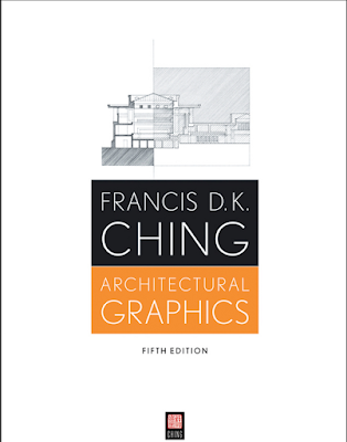
Architectural Graphics
This is a book cover I found at the library for architectural graphics. The reason the cover stood out to me is because of the clean design. The design only uses several colors and the thin type gives it a clean modern feel. The sketch on the top is also very interesting and a lot less messy than my sketches which adds to the clean feel. If I did anything different I would probably make the title of the book larger than the name of the author.

Children of Eden
This is a book I ran across at Walmart that really caught my attention because of the unique cover design. One of the reasons it caught my attention is because of the colors and the alignment of the title. I think that having the 2 main characters in the cover and changing the transparency and color of both makes it a unique design. The font the designer chose along with the type treatment is interesting and attention grabbing. I have not read this book but the design sure makes me want to!

Wednesday, October 5, 2016
Holly Burger
For this weeks blog post I decided to post a piece of inspiration I am using for a menu design. I found this design on underconsideration.com/artofthemenu. The reason I really like the design is because it is very clean and the designer was very consistent. He is even consistent on the material that he prints on. The designer aligns the type very well and make it easy to see the various items on the menu. I think that the consistent border catches my attention the most. Overall I think it is a very clean and well done design.


Wednesday, September 28, 2016
The Isle of the Lost


For this weeks blog post I decided to post the book cover for "The Isle of the Lost." I found this book in my little sister's book collection and she is only 7 years old so I am sure the design of the cover had a big influence as to why she chose it. The function of this book cover is to engage the reader to purchase the book. The cover is very colorful and uses playful fonts. The playful title font looks as if its a vine coming from the apple and I think its very eye-catching. The back part of the cover also uses the same vine design by having a frame around a picture similar to the title. Another reason I liked the design was because of the color choice as well, it is very bright and unique and gives a mysterious feel.
Friday, September 23, 2016
GQ Magazine

For this week’s blog post I decided to post the beginning page to an editorial I found in the GQ magazine. The reason I chose to post this is because it was eye-catching because of the colors, and the playful font. The article’s main idea is the 18 best hair people of all time. The font to this is very unique it is made of lines and breaks many typographic rules. One thing that caught my attention is that if you rotate the image it looks like 2 faces. The small letters depict the eyes and the large letters depict the hair and mouths.
The function of this modern playful design is to attract readers to the article so they can start reading.
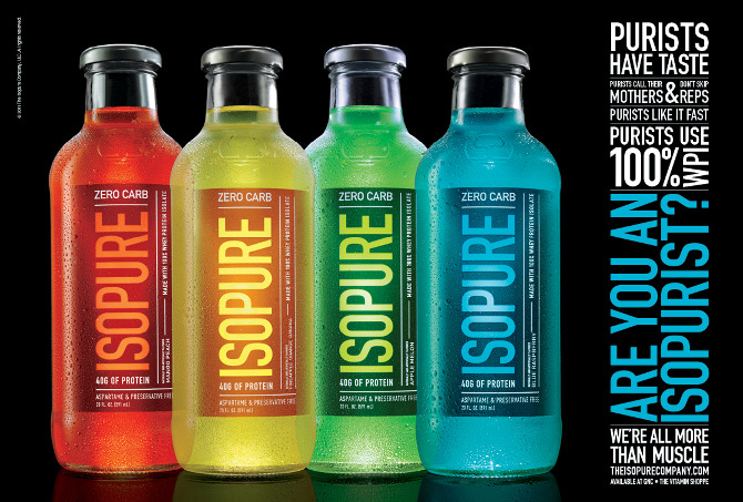
Isopure
For this weeks blog post I decided to post about a product I came across on facebook a while back for a protein drink and then came across again recently in the 2013 Graphis Design Annual in the Parkland library. The product had a poor design before as shown in the picture and was redesigned in order to create stronger brand recognition.

Isopure had a dated look and was modernized by simplifying the design. The result was the design below. The redesign became a success after it strengthened retail sales. According to CEO Hal Katz, sales went up 20% with the new design of the product.

The reason I chose this design is because I almost bought it before myself before knowing it was redesigned. The design of a product can influence a consumer greatly and I found it interesting reading the article about the design on the annual because it describes how the design affected the company's sales. Another reason I really like the design is because it is very colorful, eye-catching, and simple.

Isopure had a dated look and was modernized by simplifying the design. The result was the design below. The redesign became a success after it strengthened retail sales. According to CEO Hal Katz, sales went up 20% with the new design of the product.
The reason I chose this design is because I almost bought it before myself before knowing it was redesigned. The design of a product can influence a consumer greatly and I found it interesting reading the article about the design on the annual because it describes how the design affected the company's sales. Another reason I really like the design is because it is very colorful, eye-catching, and simple.
Monday, September 12, 2016
Chobani Blog
For this weeks blog post I decided to post a packaging I found I Facebook on the Chobani page. Chobani is very popular for their greek yogurt and this week I came across an interesting design for their new fall flavor, pumpkin spice. The reason I chose this design is because I think that have the packaged designed in that shape causes people to choose it over others. The design is simple and it uses a thin type style throughout the design. One of my favorite things about the design is the color choices. I think the designer did a great job at that.


Monday, August 29, 2016
IQ TV
For this blog post I decided to post a logo that I found in the book, The Secret Life of Logos that I found at the Parkland Library. The book features many logos designs from how the designs start to the final decision. The reason I chose this one for IQ TV is because I think it is very clever and the designer also got very lucky. The book had many concepts that the designer approached but leaned more towards the upper left design. I think that the fact that he uses an I and a Q to add emphasis to the eye is very unique.


Monday, August 22, 2016
Bai Drink
For this weeks blog post I decided to post about a product packaging that I found at Arcola's gas station, Phillips 66. I was searching for something new to drink and decided on purchasing this product because of its design. I turned out enjoying the drink a lot and have since then bought different flavors. This is a design for their flavor Antioxidant Cocofusion. The reason the design caught my attention is because of the use of space and the simple modern layout.


After searching online on the Bai Drinks website for other products, I came across this design for another one of their coconut drinks which I found to be very creative. The design is for an unlimited castaway edition to the same coconut drink. The design uses a coconut to convey a sailboat and uses the sailboats mast and mainsail to add creative type.

Subscribe to:
Comments (Atom)